

With the increasing competition in the luxury retail industry, luxury stores are constantly seeking innovative ways to enhance the customer experience. One such approach is the careful selection of color temperature in their stores. This article delves into the significance of color temperature selection in luxury stores and explores how it can impact the overall shopping experience.
Introduction to Luxury Store Color Temperature Selection
Color temperature plays a crucial role in creating an atmosphere that aligns with the brand image and appeals to the target audience. Luxury stores understand the power of color and its ability to evoke emotions and create a memorable shopping experience. By selecting the right color temperature, luxury stores can create an ambiance that enhances the perception of luxury and exclusivity.
The Impact of Color Temperature on Customer Experience
Color temperature can significantly impact the customer experience in luxury stores. Different color temperatures can evoke different emotions and reactions, making it essential for luxury brands to choose the right shade for their stores. Here are some key impacts of color temperature on customer experience:
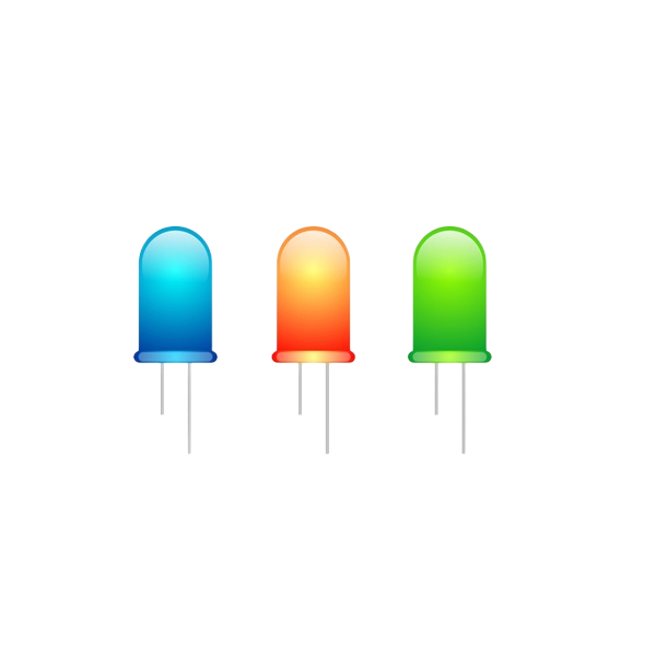
- Emotional Connection: Warm colors like red, orange, and yellow can evoke feelings of warmth, excitement, and energy. Luxury stores often use these colors to create a welcoming and inviting atmosphere that encourages customers to explore the store.
- Perception of Luxury: Cool colors like blue, green, and purple are often associated with sophistication and luxury. These colors can make the products appear more exclusive and premium, enhancing the overall perception of the brand.
- Comfort and Relaxation: Neutral colors like white, beige, and gray can create a sense of calm and relaxation. This can be particularly beneficial for luxury stores that aim to provide a serene shopping environment, allowing customers to focus on the products and their experience.
- Visual Clarity: The choice of color temperature can also affect the visual clarity of the store. Warm colors can make the products appear more vibrant and eye-catching, while cool colors can create a more subdued and elegant look.
Strategies for Selecting the Right Color Temperature
Choosing the right color temperature for a luxury store requires careful consideration of various factors. Here are some strategies that luxury brands can use to select the appropriate color temperature:
- Brand Identity: The color temperature should align with the brand’s identity and values. For instance, a brand known for its minimalist and sleek design may opt for a neutral color palette, while a brand that emphasizes warmth and hospitality may choose warm colors.
- Target Audience: Consider the preferences and cultural backgrounds of the target audience. Different regions and demographics may have varying preferences when it comes to color temperature. Researching the target audience’s preferences can help in selecting the right color temperature.
- Product Range: The color temperature should complement the products displayed in the store. For example, if the store specializes in skincare products, cool, soothing colors may be more suitable.
- Lighting Design: The lighting design should be in harmony with the chosen color temperature. The right lighting can enhance the visual appeal of the store and its products, further enhancing the customer experience.
- Competitor Analysis: Analyze the color temperature selection of competitors to gain insights and differentiate the luxury store’s ambiance.
The Role of Color Temperature in Store Design
In addition to creating an emotional connection with customers, color temperature plays a vital role in store design. Here are some aspects of store design where color temperature is crucial:
- Display Windows: The color temperature of display windows can influence the perception of the products on display. Warm colors can make the products appear more inviting and appealing, while cool colors can create a sense of exclusivity.
- Merchandising Layout: The color temperature of the shelves and display areas can impact the way customers perceive and interact with the products. A harmonious color scheme can guide customers through the store and highlight key products.
- Brand Logo and Signage: The color temperature of the brand logo and signage should complement the overall color scheme of the store, reinforcing the brand identity and creating a cohesive look.
Conclusion
In conclusion, the selection of color temperature in luxury stores is a crucial aspect of creating an exceptional customer experience. By carefully considering the impact of color temperature on emotions, perception, and overall ambiance, luxury brands can enhance their store environment and differentiate themselves from competitors. As the luxury retail industry continues to evolve, mastering the art of color temperature selection will undoubtedly play a pivotal role in shaping the future of luxury shopping experiences.